A case study on designing Zinnia — a modern design system built to help Rose Rocket scale with a focus on speed, consistency, and accessibility. I led the effort from the ground up, creating scalable tokens, standardizing documentation, and delivering robust UI kits to unlock huge impact.
✅ Faster velocity
UI kits and templates reduced repetitive work, helping teams design and ship faster.
✅ Single source of truth
Clear documentation and tokenized components created a shared language between design and dev.
✅ Built-in accessibility
A new color scale ensured WCAG 2.0 compliancy out of the box.
Role
Lead product designer
Team
1 product lead, 3 product designers
Duration
Jan 2022 – Ongoing
Tool(s)
Figma
Storybook
Leonardo
🌸 Why "Zinnia"?
I named our design system Zinnia, inspired by the first flower grown in space and as a nod to our company name, Rose Rocket. Like any flower, a design system should grow, adapt, and evolve over time. "Zinnia" serves as a reminder of that goal.
The Problem
A system that wasn't 'system-ing'
When I first joined Rose Rocket, the design system wasn’t really a system at all. The Figma file was disorganized, components were scattered, and the product UI was a patchwork of out-of-the-box libraries. This created a number of challenges:
🧩 No single source of truth
Designers and developers worked without a shared system, leading to misalignment and duplicated effort.
🔧 Reinvented patterns
Without reusable components, devs hardcoded UI repeatedly, wasting time and introducing inconsistencies.
🐢 Slow R&D velocity
Without a unified design system, building even simple interfaces took longer and required constant clarification and rework.
🎨 Inconsistent UI & UX
Core patterns like buttons, inputs, and tables looked and behaved differently across the app.
The Solution
Rebuilding from the ground up
To fix the chaos, I played a key role in the effort to overhaul our design system. This wasn’t just a cleanup—it was a foundational rebuild that brought alignment, consistency, and speed across teams.
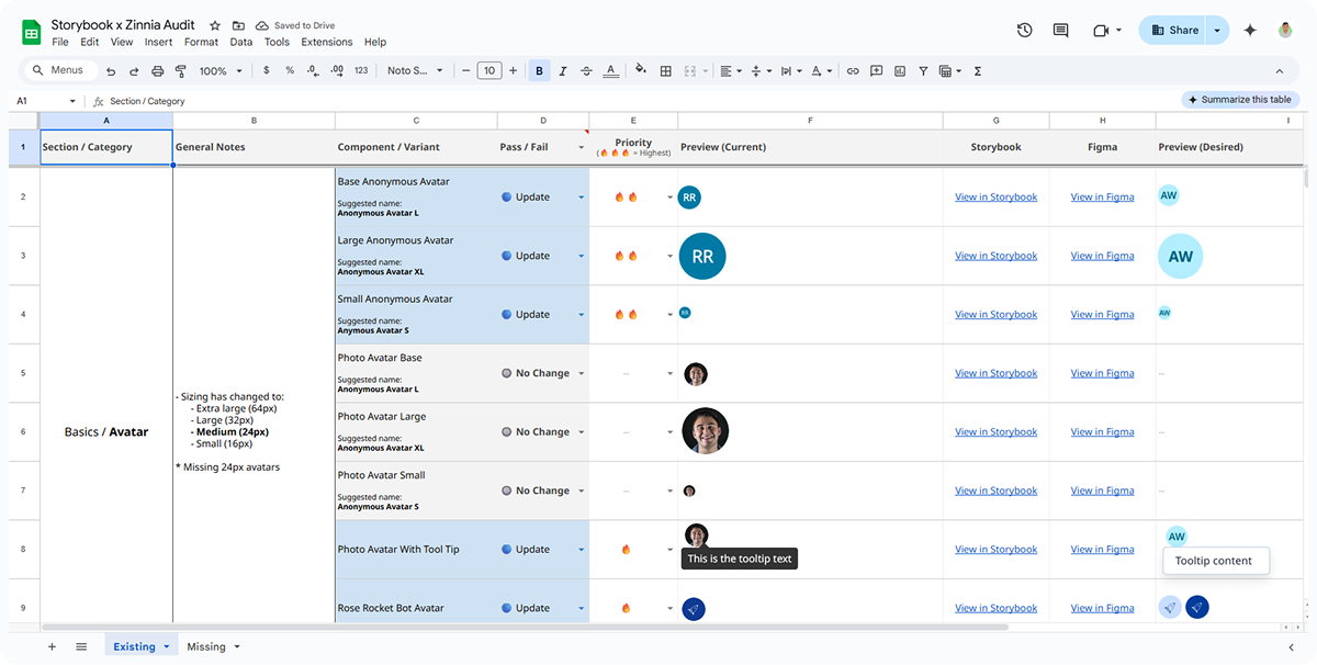
Step 1: Audit & align
I kicked it off with a full audit of the existing system. I catalogued inconsistencies, documented accessibility gaps, and prioritized what to fix first. This helped set the direction and got the team aligned.
A screenshot of the audit spreadsheet I created, showing notes, links, pass/fail scoring, and priorities.
Step 2: Revamp accessibility
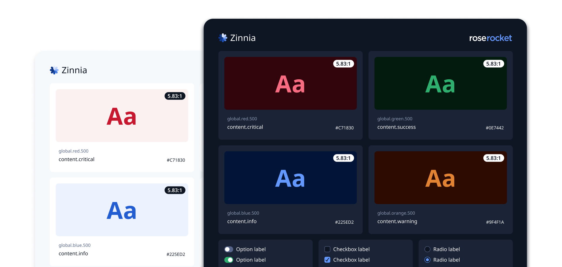
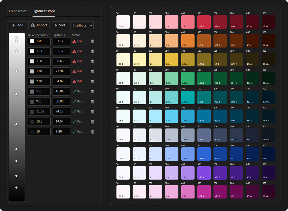
One of the biggest gaps I found in the audit was our color scale. It was manually created, inconsistent, and failed to meet accessibility standards.
To solve this, I rebuilt it from the ground up using contrast as the foundation. The new 50–900 scale ensures all midtones (500 and up) meet WCAG 2.0 standards on neutral backgrounds.
Image depicting the updated color scale built using contrast-based tooling.
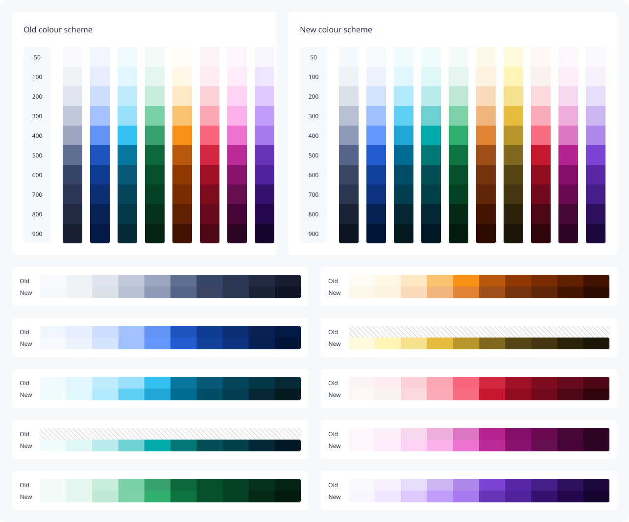
Before-and-after comparison of our colour palette.
Step 3: Rebuild & tokenize
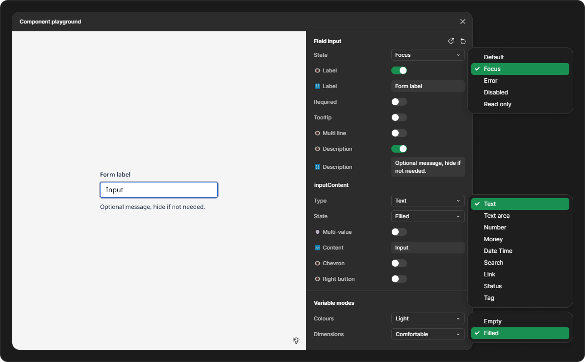
With the foundation set, our team began rebuilding every component from the ground up. Many of them were outdated, using frames, groups, and detached styles, which made them hard to maintain. We updated them using modern Figma features like Auto Layout and Variant properties to make them more scalable and consistent.
Screenshot of our refactored field input, showcasing boolean, text, and other variant properties.
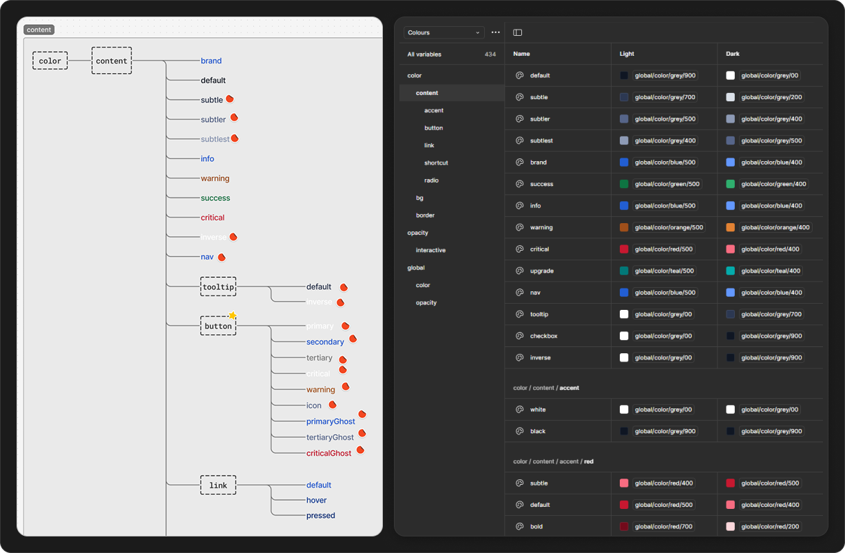
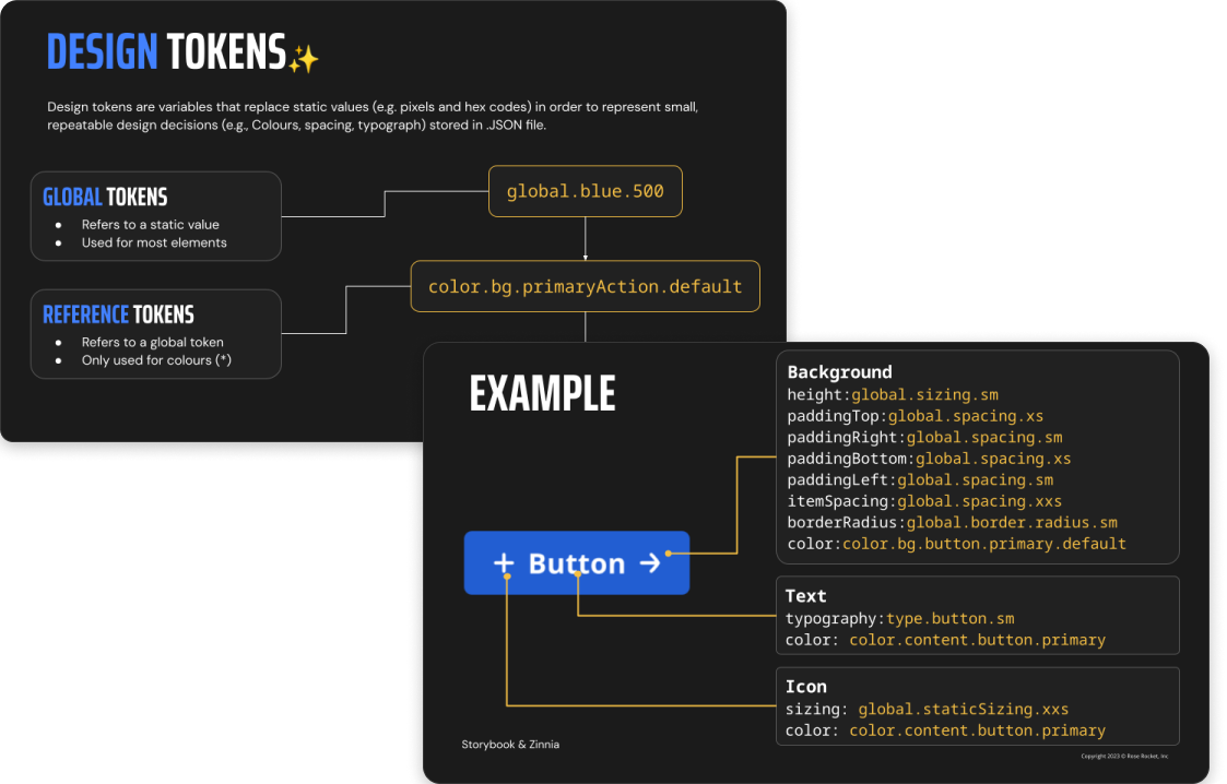
In parallel, I introduced design tokens—defining their naming, structure, and architecture from the ground up. I also ran company-wide sessions to drive adoption and teach teams how to use them effectively.
Left: FigJam brainstorm of the token structure. Right: Finalized tokens & modes implemented in Figma.
Screenshots from the company-wide presentations.
Step 4: Organize and scale the system
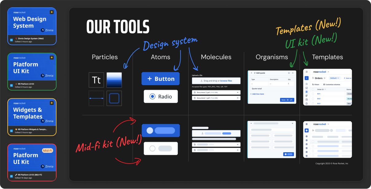
To bring structure and scalability, I introduced atomic design principles, organizing components into Particles, Atoms, and Molecules for easier navigation and maintenance.
An overview of our Atomic design framework and file structure in Figma (colour-coded).
UI kit
As a team, we then extended it to include Organisms and Templates. We built a comprehensive UI Kit based on Rose Rocket’s three layout paradigms:
Boards – Spreadsheet-style pages showing all records
Records – Multi-panel layouts for viewing/editing a single record
Widgets – Modular UI blocks for core workflows
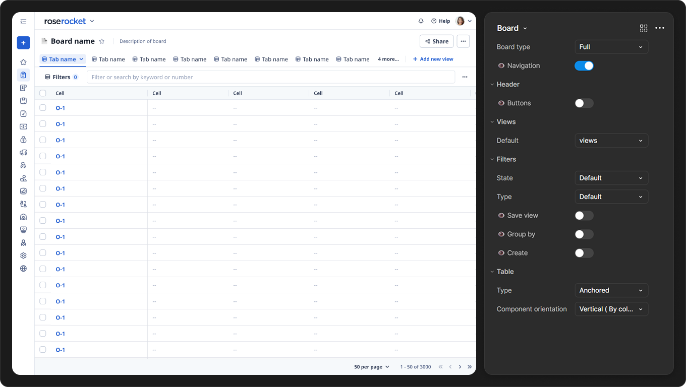
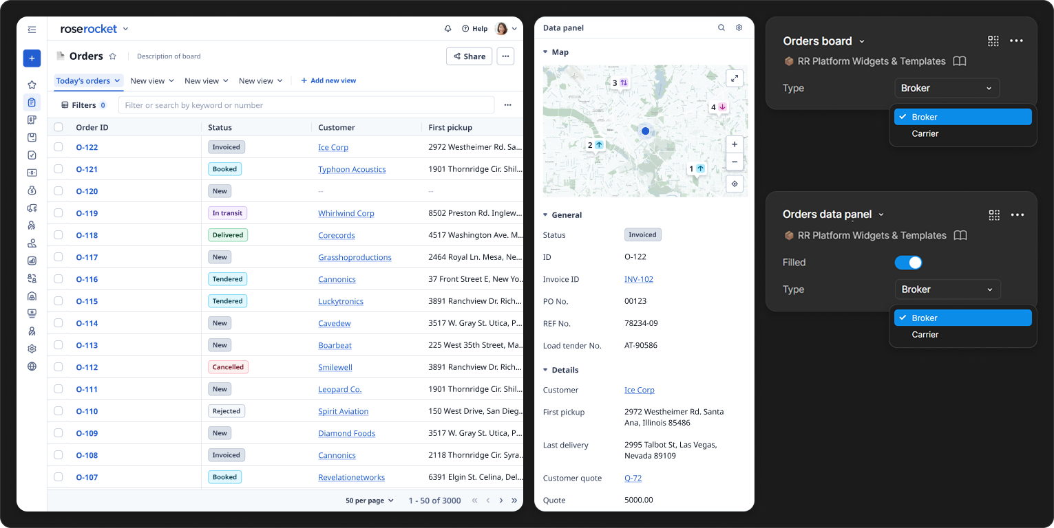
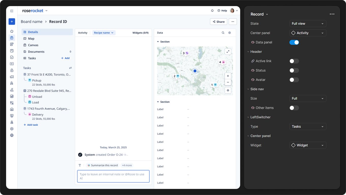
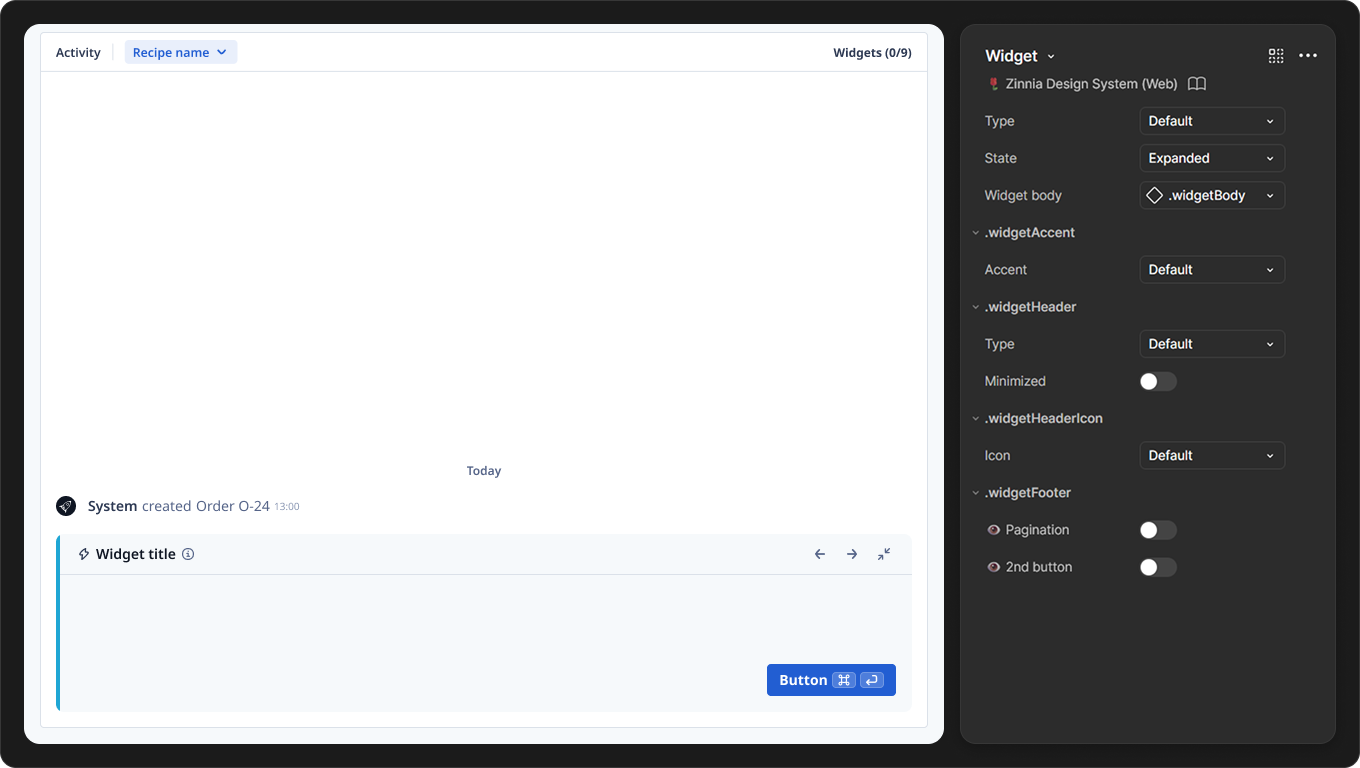
Board
Record
Widget
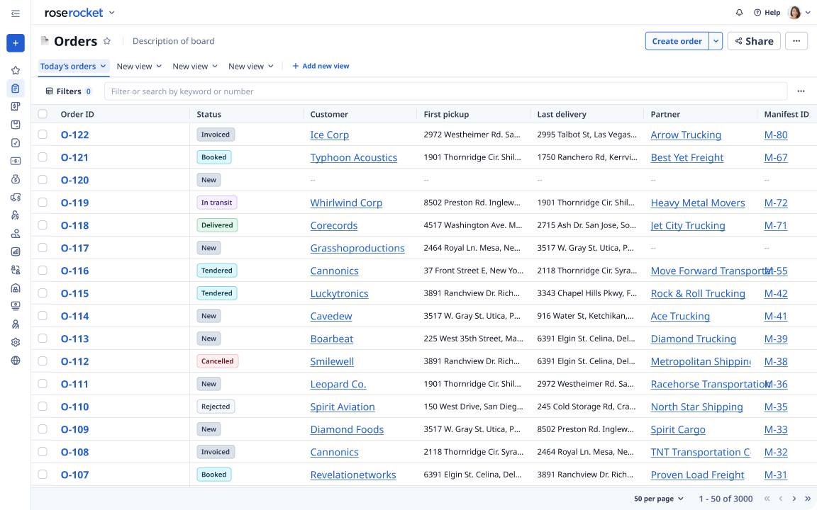
Template kit
Our UI kit transformed complicated UI into reusable, drag & drop layouts. To accelerate prototyping, we built a separate template library filled with realistic data, enabling teams to create high-fidelity mockups in seconds.
A screenshot of an Orders template, with filled-in data.
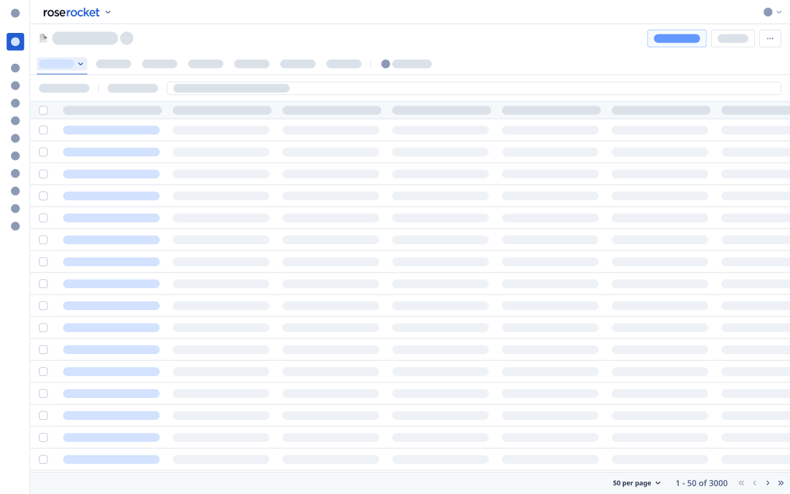
Mid-fi kit
We also introduced a mid-fi kit for low-effort flows and early feedback—helping designers move even faster during early ideation.
Through our efforts, Zinnia became more than a design system—it became the foundation for faster, more aligned product development:
⚡️ Faster velocity
UI kits and templates reduced repetitive work, helping teams design and ship faster.
🤝 Single source of truth
Clear documentation and tokenized components created a shared language between design and dev.
♿ Built-in accessibility
A new color scale ensured WCAG 2.0 compliancy out of the box.
Reflection
Building the system is only half the work
This project taught me that a design system isn’t just a library—it’s a shared foundation. When designers and developers speak the same language, we move faster and stay aligned. But building the system is only half the work:
Adoption matters just as much as creation. The company sessions helped make tokens stick
Good documentation turns a system into something practical and usable
Designing systems is fun! Bringing order to chaos and seeing it scale has been incredibly rewarding
 Figma
Figma
 Storybook
 Leonardo